Gmail updates
New Gmail compose formatting and download options
What’s changing
We’re adding three new features to Gmail:
- Shortcut to undo/redo in the compose window
- Shortcut to strikethrough text
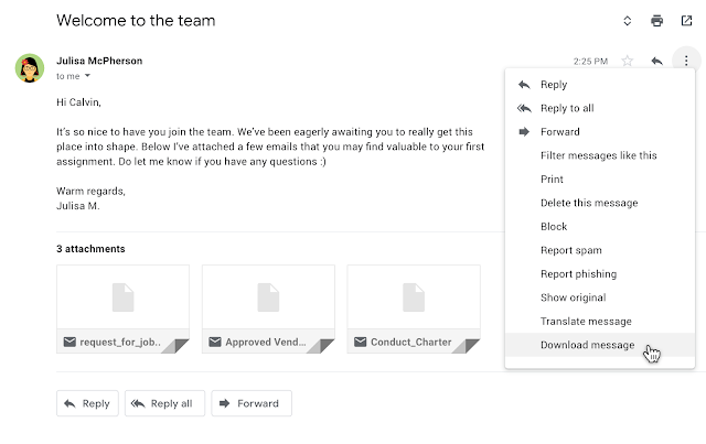
- Ability to download messages as .EML files in rfc822 format from Gmail on the web
Who’s impacted
End users
Why you’d use it
- Undo/Redo: If you need to undo an action, like if you accidentally delete the content of your draft of an email, you can do so straight from the compose view. Anytime you have undo, you want to also have the option of redo, so we’ve added that as well.
- Strikethrough: Strikethrough is a visual cue that something has been completed or can be used as an edit suggestion. We’ve heard from you that this functionality is critical to quickly and efficiently write emails, especially when you want to visually indicate a change in language.
- Download as .EML: This format is recognized by other email clients, allowing you to view the Gmail content along with attachments within these clients. In addition, with this functionality users can now add these downloaded messages as attachments in their emails.
How to get started
- Admins: No action necessary.
- End users – new compose formatting: Click on the formatting menu in the Gmail compose window.
- End users – new download format: Open the overflow (three dot) menu and select “Download message.”
Easily take action in Gmail with new right-click context menu options
What’s changing
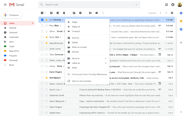
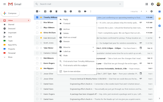
We’re adding more options to the right-click context menu in Gmail.


Who’s impacted
All end users
Why you’d use it
With these new options, you can take even more actions, directly from a message, in your inbox such as:
- Reply to, or forward, an email in one click from the main page
- Search for all emails from a sender
- Search for all emails with the same subject (if conversation view is turned off)
- Open multiple emails in multiple new windows at the same time
- Easily add a label or move an email
How to get started
- Admins: No action necessary.
- End users: The context menu can be opened by:
- Right-click
- Ctrl+click on Mac keyboards
- The menu key on Windows keyboards.
A new look and feel for Gmail on mobile
What’s changing
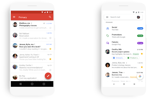
In addition to similar announcements we’ve recently made for Drive and Docs, Sheets, Slides, and Sites on the web, we’re now bringing a new look to Gmail on mobile, too.
As part of the new design, you can quickly view attachments—like photos—without opening or scrolling through the conversation. It’s also easier to switch between personal and work accounts, so you can access all of your emails without breaking a sweat.
A more minimal use of color helps you focus on content and what’s important to you. We’ve also replaced the search button with a more prominent search bar at the top of the screen.
And just like on the web, you’ll get big, red warnings to alert you when something looks phish-y.
Who’s impacted
All end users
Why you’d use it
This update is part of a larger effort to bring the look and feel of our G Suite apps together as a whole, and always with ease-of-use in mind.
How to get started
- Admins: No action needed
- End users: You’ll see the changes coming to your Android and iOS devices over the coming weeks.
Additional details
We’ve already updated the web apps for Gmail, Drive, Calendar, and most recently Google Docs and Sites. In the coming weeks, you’ll see the new mobile design in Gmail on Android and iOS, with more G Suite mobile apps to follow later this year.


